Tramcar Colours
By John Prentice
|
What colour was that tram? David Voice produced a fine book with this title which gives a complete guide to the names of the liveries of British Trams. But what actually were these colours, and why is it that when you finish your model some clever Dick will tell you that you have got it wrong? Many years ago I worked on the chemical side of both the pigment and paint making industries, so I have a little insight. In this article I cannot tell you how to find the correct shade of colour, but I hope at least to explain why the problem is so difficult and why perhaps a 100% accurate solution is impossible.
Firstly we have colour perception. Did you know that the human brain cannot remember subtle shades of colour exactly? If you ask an expert to study a colour and then to go away into another room and match it from memory, he or she is usually wrong. This being the case it is hopeless to expect anyone to paint their model and get it exactly right from memory alone, or for any self-styled expert to tell you that you have slightly the wrong shade of a colour.
Next we have light. Pure white light is a mixture of all the colours of the spectrum, but most lighting is far from pure. Tungsten lamps are distinctly yellow. Fluorescent lamps tend towards blue or pink, although there are special "daylight" types which try to replicate daylight. Exhibition halls and sports centres often use distinctly orange sodium floodlights. The colour of daylight itself varies with time of day and geographic location. Why should this matter? Well, coloured pigments reflect a range of light wavelengths which are different for each chemical (a phenomenon used in spectrographic analysis). Although they may look alike, the blend of wavelengths is different unless the pigments are chemically identical. This means that although paints may match perfectly under your workshop bench lamp, they may be wrong in sunlight. Of course your wife already knew this, which is why she always checks the colour of that hat against the dress in daylight, not shop light. The worst example of this is to compare browns made with natural earth colours against those made from the expensive but fast cadmium colours. The difference between daylight and tungsten light with these is astonishing. So, unless your model paint is chemically identical with the prototype, clearly impossible, then it won't match in all lights and you can only get close.
It is worth mentioning in passing at this point, that this is why colour transparency film is made in daylight and artificial light versions to compensate for the colour differences of the light (known as colour temperature). Also worth comment is that if you are looking at black and white photos and trying to guess a colour of your tram, then modern panchromatic film is sensitive to all colours whereas pre-war ortho-chromatic film is not sensitive to red, rendering it as black, and very early film is only sensitive to blue making even light yellows seem very dark.
So how do we determine what a shade is from a colour name? Well in many cases you can't. Some silly names given to modern paints, particularly automotive finishes, are just a figment of some marketing manager's fantasies. However, some of the traditional names of pigments are chemically specific so an early description, for example "Ultramarine Blue and White", can be accurately matched with modern paints. Ultramarine is a brilliant deep blue pigment originally obtained from ground Lapis Lazuli but has for many years been reproduced synthetically. Red oxide (of iron), Indian red (a deep red oxide of iron), Chrome green (chromium oxide), Cobalt blue, Cadmium yellow (cadmium sulphide), Raw and Burnt Sienna, Raw and Burnt Umber, red lead (triplumbic tetroxide), yellow lead (lead oxide), white lead (lead carbonate), Vermilion (mercuric sulphide)), Ochre and Prussian blue are all examples of chemically specific colours produced from naturally found earths or easily manufactured products. Many colour names were standardised in the 1930s by the British Colour Council and some of these have passed down into British Standard BS 381c, which contains such names as Signal red and PO (Post Office) red. (See BS 381c colour chart)
What is more difficult is the range of organic pigments which started to come into fashion in late Victorian times. At first these were made from naturally occurring organic chemicals, e.g. Munich Lake, Madder Lake, Purple Lake and Crimson Lake are derived from soluble redwoods and cochineal beetles (coccus cacti). The dye is extracted from the natural substance and is then precipitated as a pigment (or dyestuff) called a lake by adding a mordant to "fix" it. Two of the common mordants were arsenic and antimony and the salts of zinc, calcium, barium and aluminium. It is also difficult from name alone to determine exactly what the shade was, as different mordants give slightly different shades.
Nowadays all the organic colours are manufactured synthetically and so an exact chemical match to the early colours is impossible. What is more, modern paints have to be non-toxic, especially those like water and poster colours and enamels like Humbrol which are used by children. I would still not recommend drinking the stuff, but modern paints rarely contain lead, arsenic, cyanide or antimony which are often to be found in the early 20th century products.
Even if you have the right colour by reflected light, another factor is what is called the undertone. Organic dyestuffs, particularly reds, may be an exact match by reflected light but if you brush the colour out thin you will find that it is slightly transparent and that the colour of the light passing through the paint film can be a completely different colour, sometimes blue. This gives you problems if you paint over a light undercoat or add white to the colour to produce a pale tint.
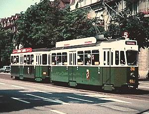
 Well what about getting hold of a bit of old tram, or even new tram and matching to that? Here we get the problems of weathering and fading. We have probably all found that if you try to touch up a chip from old paint with a pot of new, or even some of the original which has been left, then it doesn't match any more because of changes in the exposed surface. A favourite colour slide of mine of a Swiss Standard car and trailer in Bern, Switzerland (shown here) has at least four different shades of green. Which is correct? They all are I suppose, but which would you copy for a model?
The early red dyestuffs were extremely fugitive, fading out within months. At the same time many pigments were susceptible to discoloration when exposed to the sulphur dioxide so often present in the coal smoke polluted air of those days. Blue pigments tend to migrate to the surface of the paint film. Brunswick Green in its various shades was a popular vehicle colour. Traditionally it is made from a dry mixture or co-precipitation of Prussian blue (ferric ferrocyanide) and chrome yellow (lead chromate - some toxic cocktail that!). In time the fast blue remains or lightens but the yellow fades out or darkens to grey. I have seen a loco left in the open air for a long time where it has changed from mid-green to a dirty pale blue. Ask any older person what colour London trams were before they were red and cream and they will say brown and cream. Show them 106 at Crich in its fine purple and pale primrose and many will say that is wrong. An L.C.C. car may have originally been painted purple lake, but you can bet that the richness of the lake would have quickly gone and the colour would have looked brown. The modern paint on 106 keeps its new look. So any bit of paint recovered from an old vehicle is unlikely to be much of a guide to the true colours as new.
Which brings us to the white. Now the most common pigment for whites is titanium dioxide, but the early form of this chemical (a crystalline form known as anatase) suffered from chalking. That is the surface of the paint quickly loses its gloss and becomes covered with a chalky film. Now in flat white paints and distempers used externally, this is a bonus as the film is weathered away and the white always looks clean. But in coloured glosses which contain some white, the finish becomes pale and dull. Modern whites are made from the rutile crystalline form which do not chalk, but can be slightly yellower in colour. White lead, lead carbonate was often used for vehicle roofs, but this pigment can quickly turn to the black lead sulphide when exposed to the atmosphere and the paint turns grey.
However, the real problem with whites and pale colours is not the pigment but the varnish that the paint is made of, or is applied as a finishing coat. Although modern synthesised varnishes such as polyurethane only yellow slightly with age, the old style cooked linseed and wood oil based varnishes yellow at an alarming rate. So that pale primrose or off white soon becomes dull cream. Yellowing is most noticeable for the satin or flat varnishes. On models I use the Humbrol varnish in the glass jars for satin and matt as it yellows less, but for gloss I prefer the Humbrol polyurethane in the tins as it gives a better finish. I should add here that the colour of a gloss finish or varnished paint looks different to a matt one, even if the pigments used are the same, and that the colour of paint can change dramatically as it dries, making matching more difficult.
While on varnish it is worth noting that the yellowing effect is far worse if the finished object is kept in the dark. Look at kitchen cabinets with white painted doors. The inside soon turns cream. All oil based paints and varnishes do this, even the modern synthetics. Only soluble lacquers, acrylics and emulsion paints stay "water white". This applies to your models too if you store them in the dark. On the other hand, don't store your models in bright light either. The varnish may not yellow as quickly but the colours will fade. Particularly bad are colours printed on paper, as all printing inks are far less fast to light than paints.


Finally there is size and relative position. If you put a coloured panel next to a white one, the colour will appear to the eye to be darker than it really is. On the other hand if you put the same colour next to a black panel then it will seem lighter. In the two squares above, the green dot is the same colour (and size), but may not look it. When the whole thing is scaled down to model size the overall effect changes and the model looks wrong. Also if you take the original vehicle paint and use it on a model it often looks wrong as a large block of colour looks different to a smaller one.
So the conclusions are that you will never get it completely right. The best we can do is to follow the general modelling rule of "If it looks right it is right". If someone disagrees, then that is only their opinion and why should that be any more accurate than yours.
 Return to Tramway Modelling On-line Reference
© Copyright John R. Prentice Software 2003
 Well what about getting hold of a bit of old tram, or even new tram and matching to that? Here we get the problems of weathering and fading. We have probably all found that if you try to touch up a chip from old paint with a pot of new, or even some of the original which has been left, then it doesn't match any more because of changes in the exposed surface. A favourite colour slide of mine of a Swiss Standard car and trailer in Bern, Switzerland (shown here) has at least four different shades of green. Which is correct? They all are I suppose, but which would you copy for a model?

